Very interesting to be able to customize what some buttons do with these two functions:
- Custom key: Very useful. Allows you to assign which function to three of the six keys on the front of the monitor from among all the options you see in the submenu.
- Controller key: same as above, but with the numbered keys on the cable remote control.
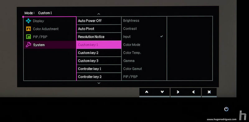
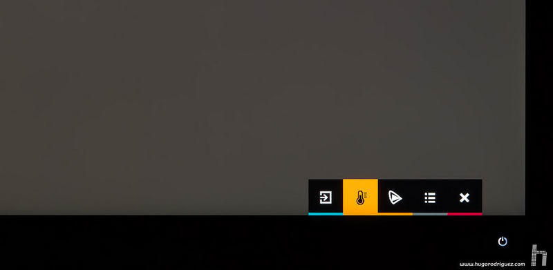
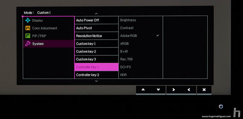
Image quality
This is undoubtedly one of the most important aspects. The first aspect to evaluate is the type of panel and, as it could not be less, it is an IPS of the latest technology. In fact, there are very few IPS panels with this resolution nowadays.
It’s curious but in a short time BenQ is making a name for himself in this difficult world. If several years ago nobody associated this brand with high-end monitors for photography, now things have changed, and more and more users mention it when talking about this kind of monitor.
The most remarkable thing about this model is the very high pixel density, since concentrating almost 4000 px wide on a monitor only 27 inches of diagonal, is really a very high value. It is so clear that you can say that it is already close to the definition of a photograph printed on paper. With its 160 ppi it is very close to the 180 that are usually used in medium quality photographic prints. And that, looking at it from a little more than 20 cm apart, but at about 40 cm the pixel is absolutely indistinguishable to the eye.
In addition to the incredibly high resolution of the panel, it has a color gamut similar to that of the Adobe RGB 1998 space, something that is already considered common in today’s high-end monitors. In addition, the panel is of 10-bit (currently the highest level), so the gradations can be so smooth that it will be impossible to see «steps» in a gradient. However, in order to fully enjoy the 10 bits, the whole chain from the moment the image is generated until it reaches the monitor has to work at the same color depth. Therefore, the graphics card must be able to do this, the software you use (for example, Photoshop can do this, but you must activate it in the preferences), the driver and the cable that goes to the screen.
The brightness is, as usual, high. For my taste, too high. Since photographers and videographers often work in rather dark environments, excessive brightness is not particularly helpful. BenQ announces a maximum brightness of 350 Cd/m2; I have measured 342 Cd/m2. Native contrast and dynamic contrast are also announced, with 1000:1 and 20 million:1 respectively. In my tests I measured a native contrast of 1340:1, one of the highest currently. By the way, I think this is the first time I have seen a manufacturer announce both data clearly and unambiguously.
It is also interesting to note that the system that BenQ uses to regulate the brightness does not disturb your vision, as it happens with other manufacturers of typically of lower categories. The technique usually used produces a flicker that cannot be easily detected with the naked eye, but if you take the camera out of your phone and try to take a picture of the screen, then you will notice the flicker when you look at it through your phone. The high-frequency system used by BenQ makes the image appear much more stable and therefore it is impossible to notice any flickering, even through a camera. Of course, this is also appreciated because after hours of working in front of this screen, because watching it becomes less tiring.
The quality of the LUT 3D is very good, and allows to shape the tonal range through the hue and saturation controls, being able to control independently each one of the six primary ones. Admittedly, it does not have the fineness of much more expensive model, such as NEC Spectraview or EIZO CG, although it is also true that the difference in quality is not correlated with the difference in price.
The color gamut
The majority of today’s «photo» monitors are «wide gamut», which means that they have a very similar gamut to Adobe RGB, as is also the case with this SW271.
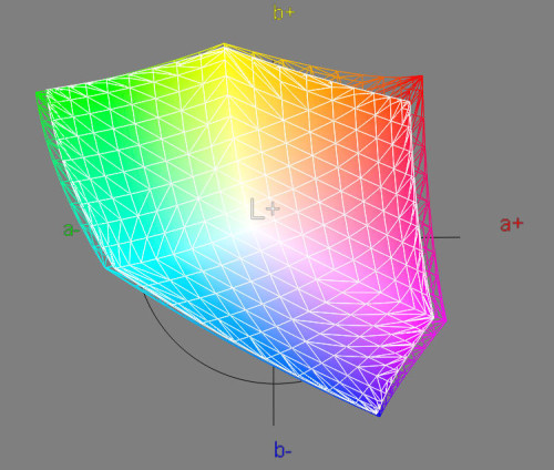
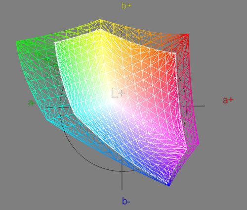
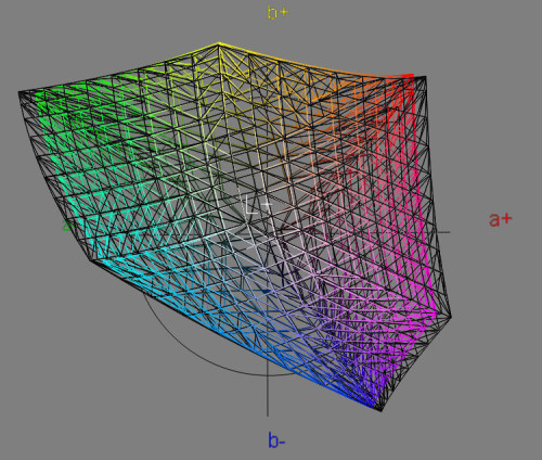
Specifically, and according to my measurements, the range of this monitor is 9.2% larger than that of the Adobe space, and it covers it by 97% (which means that Adobe stands out for the monitor space by 3%; specifically its magentas and blues are a bit brighter).
In the case of the sRGB, the SW271 range is 58% larger and covers it almost completely (99.8%).
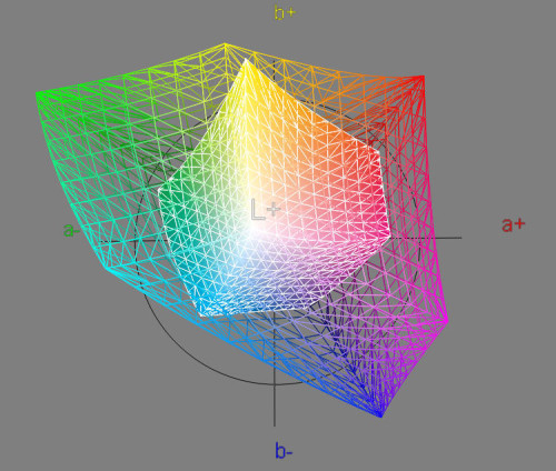
When compared to the most popular space in Europe for offset photographic printing, the FOGRA 39L, the result is this:
Where it can be seen that it covers it completely (99.9%) and surpasses it by a wide 290% in size. So, an excellent monitor for designers who submit work to print.
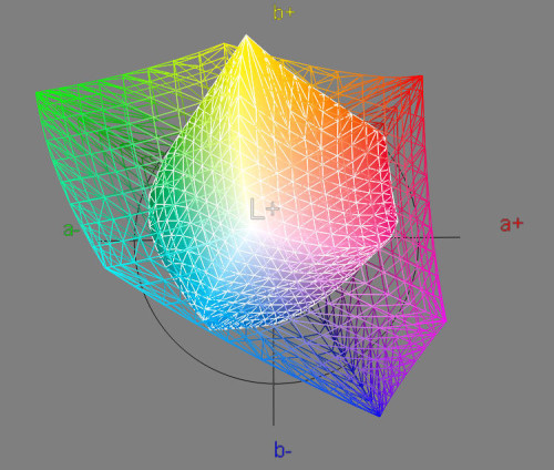
What about the new XCMYK?
The comparison is more complicated for the SW271, certainly, since this new printing standard is clearly higher than the previous one. But the SW271 has a 207% increase in volume and a respectable 97.2% coverage. Only the most saturated yellows and cyan are missing.
Compared to its predecessor, the SW2700, it has a slightly narrower gamut, perhaps due to its higher resolution (I’m not sure but probably SW2700’s larger pixel size allows less «wasted» surface area in inter-pixel spaces, which allows white light to come out and blend in with the color, decreasing it).
Continues in page 4…

