The color gamut
The majority of current «photo» monitors are «wide gamut», which means that they have a gamut very similar to Adobe RGB, as is also the case of this SW240.
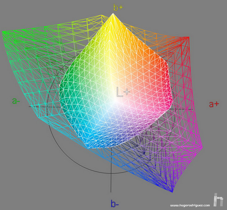
Specifically, and according to my measurements, the gamut of this monitor is 18.7% larger than that of the Adobe space, and covers it by 99.6% (which means that Adobe stands out for the space of the monitor only 0.4%):
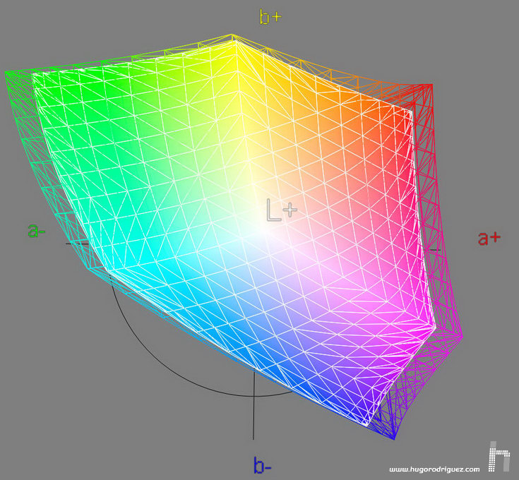
Comparison of the SW240 (mesh) gamut against the Adobe RGB 1998 (solid) space.
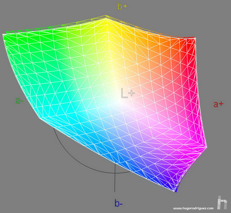
In the case of the sRGB, the SW240 gamut is 59.8% larger and covers it (and this time, without the ‘almost’) completely (100%):
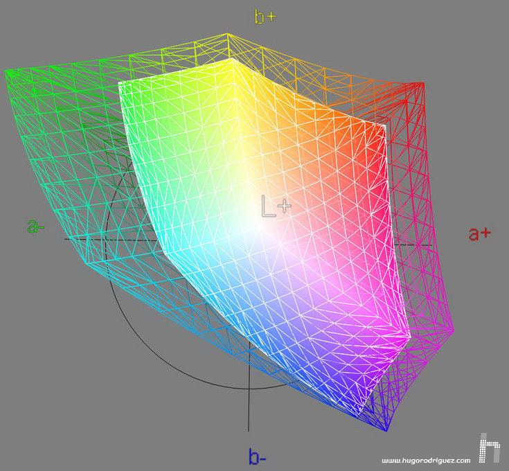
Comparison of the SW240 (mesh) gamut against the sRGB (solid) space.
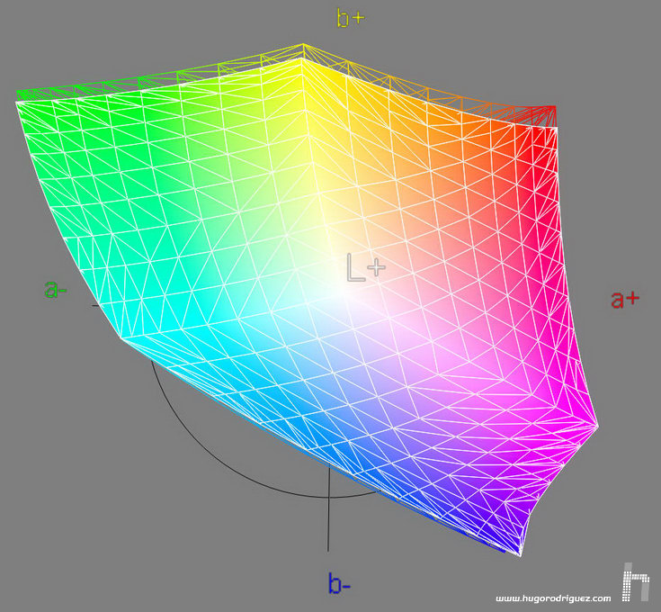
When compared to the best known space in Europe for photographic offset printing, the FOGRA 39L, the result is this:
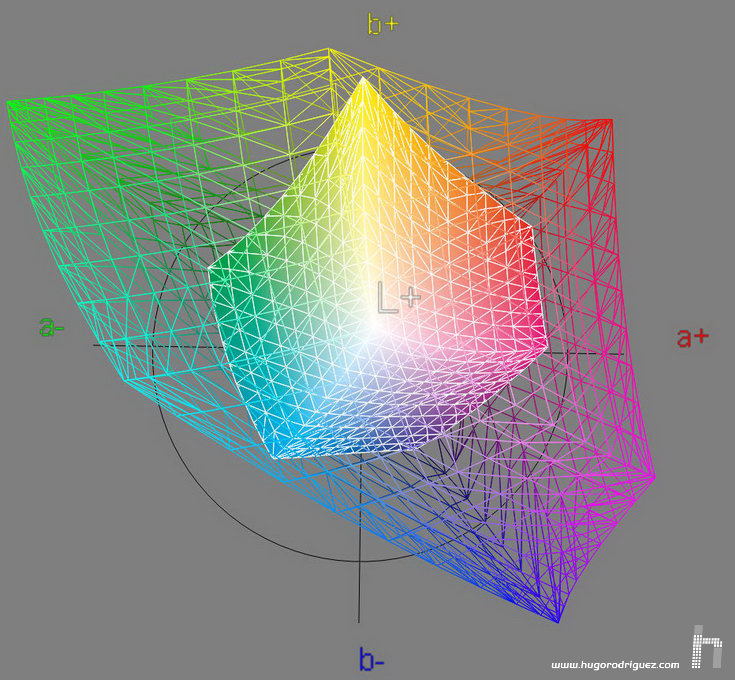
Comparison of the SW240 (mesh) gamut against the FOGRA39 CMYK (solid) space.
where it can be seen that it totally covers it (a 100%) and surpasses it by a wide 315% in size. So, an excellent monitor for designers who send their work to print.
What about the new XCMYK?
Comparison of the SW240 (mesh) gamut against the XCMYK (solid) space.
The comparison is more complicated for the SW240, certainly, since this new printing standard is clearly higher than the previous one. But the SW240 succeeds by having 224% more volume and covering it by a respectable 97.7%. Only the most saturated yellows and cyans escape to it.
Compared to its predecessor, the PG2401, this being a better performance monitor, we see that the new SW240, while considerably cheaper, has a larger gamut. It’s not a huge step though, but 8% bigger in just a couple of years is remarkable!
Comparison of the SW240 (mesh) gamut against the PG2401PT (solid) space.
And if we compare with a much more expensive monitor like the NEC Spectraview PA242w, the whole thing gets very interesting:
Surprise! The new and «modest» SW240 has better reds, oranges, yellows and greens than the NEC, and that costs almost three times more. Yes, it’s true the NEC wins in blues, but there remains the BenQ standing up like David in front of Goliath and holding its ground as a champion. These kinds of comparisons show that if BenQ don’t bring out a clearly better monitor than the NEC, considered the crème de la crème, it’s because they don’t want to, not because they don’t know. They are simply not interested in that business segment. To make such a good monitor is not easy -we all agree on that- but to make one as good as that and then release it at almost a third of the price is much more difficult!
Comparison of the SW240 (mesh) gamut against the NEC Spectraview PA242 (solid) space.
Color reproduction
The SW240 comes factory-calibrated, as it is usual in this category. But that doesn’t mean that you don’t have to profile it once you connect it to your computer. In this case (as well as in other models) it turns out that several of its presets do almost not require profiling (in Adobe RGB, sRGB modes and Rec709 as well), because the accuracy with which they are adjusted has an error less than Delta E 2 (which is very low). Even so, they have to be integrated in the workspace in which they are going to be, which means that the brightness and the white point will have to be calibrated. The good thing is that the gamma and the gamut already come perfectly calibrated from the factory.
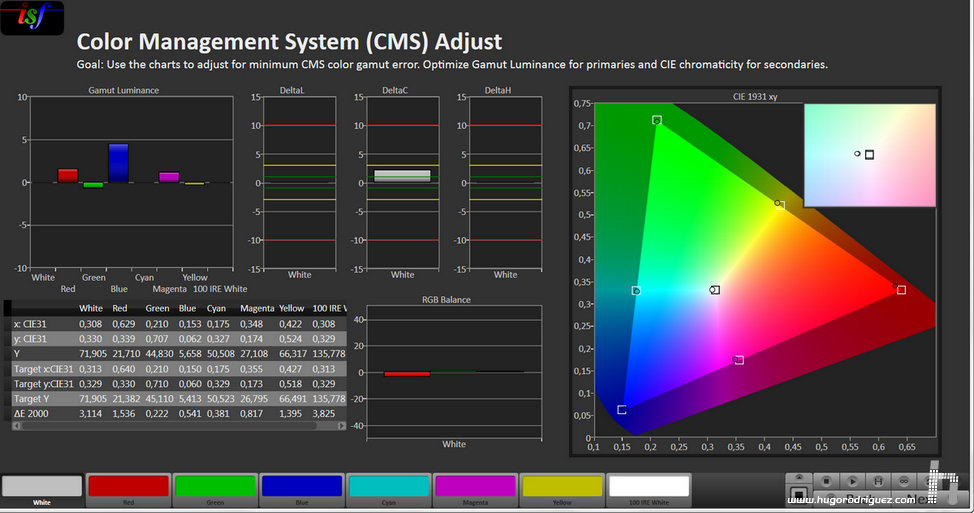
Let’s see it. To take the measurements I have used my i1Pro2 together with CalMAN. The sRGB preset produces these results:
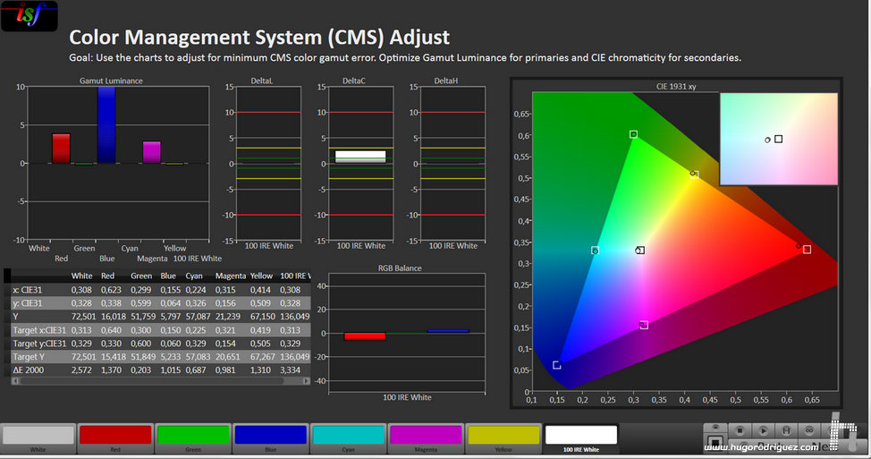
Analysis of the factory pre-calibrated sRGB mode. In the graph on the right the circles indicate the location of the primary colors on the map; the little squares where they should be.
The location of the primaries is almost nailed, except for the red that is displaced, although its error (you can see in the table, in the last row) is dE 1.3, well below the 2.0 announced by the mark.
It can be seen that none of the colors exceeds the deviation of Delta E 2 announced by the manufacturer (this can be seen in the last row of the table that appears at the bottom left of the screenshot), although the white deviates very slightly towards green.
Let’s see how the Adobe RGB preset behaves:
Analysis of the factory pre-calibrated Adobe RGB mode. In the graph on the right the circles indicate the location of the primary colors on the map; the little squares where they should be.
Again, the results are excellent. Only the white deviates slightly more than expected, as does the red. This does not detract from the fact that all colors fulfill what was promised: no more deviation from a Delta E 2.
Continues in page 5…